 | |
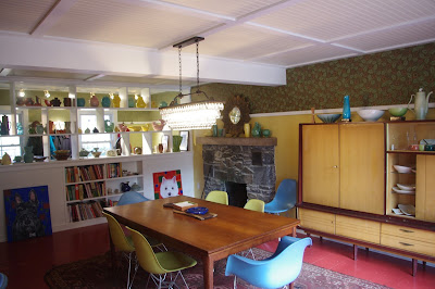
| New Larger Dining Room Connects well to Back Patio and Kitchen |
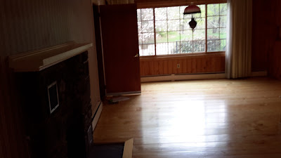
This historic Rhinebeck home was out of date- and I don't just mean the big radiators and the frumpy wall paper. The rooms were small, and there were too many walls jutting into spaces making them feel awkward. The space inside of the front door was tight, with no place to put one's coat or boots or greet a guest or stow a briefcase. A more recently added attached garage had an unfortunate door placement directly into the dining room. The "wing wall" and 9 s.f. slate tile attempting to partition off a "foyer" only served to accentuate how cramped the entry was. Here is what we did to make this house work for the new family who moved in. (Before pictures at end of post)
 |
| Boxed in Steel I Beam Allows Wall to be Removed |
 |
| Hidden Door to Garage - Connects to Mud Room |
 |
| Panelized Ceiling, Painted Wood Floor, Super-wide Glass Door |
 |
| Wall of Cubbies Separates of Front Area into a Mud Room |
The wall separating the front (living) from the back (dining) was removed and a steel beam was put in it's place to hold up the second floor. The wing wall shielding the front door from the rest of the living room was removed, as was the small slate floor inset. The door that dumped unceremoniously into the dining room from the attached garage was infilled to allow a long wall for furniture. The old mechanical system and radiators were removed, and a new, efficient whole-house A/C and air heat was installed supplied by new mostly-invisible and using-no-space grills in the floor. The front of the house was partitioned off with a floor-to-ceiling open built-in shelf unit. This front space functions as a "mud room" with the garage door relocated there and a new absorptive, reclaimed brick floor all across the entry area. The back of the house got a new super-wide sliding glass door to access the stone patio (one wonders why there was not a door to access that patio already...) and became a large dining room, while the function of living room was combined with the family room. Ironically new wall paper was applied- but sparingly over a high chair rail, and the ceilings were given a 'bead-board & trim' treatment. The too-pale pine floor was painted and unique lighting was selected and installed.
 |
| Room for a Large Cabinet, now that Garage Door is moved |
The changes are transformative. The space feels larger, lighter, brighter and decidedly up-to-date. The home now functions much better for the family who lives there- giving them a place for boots and backpacks, as well as a luxuriously large dining room for everyday homework or weekend entertaining. (They made the big decision of "who needs separate living and family rooms?) I'll show you that family room renovation in another post. As an aside- a section of the wood timber that the Steel I beam replaced was salvaged as the new fireplace mantle shelf.
 |
| Before- Looking toward the back- see open door to garage on left and window facing patio |
 |
| Before - Walls Divided the front & back of the house (left) and closed off the Entry (right) |
 |
| Before - Wall & Slate Tile made entry cramped |
No comments:
Post a Comment