Wednesday, July 22, 2020

Classical Proportions

Shade providing porch along back/south

This "New House Next Door" is almost ready for move in day! And other than the fact that I'm telling you this is a newly built structure, if you were seeing it as you drive or bike past on the road, you might think it's an established, meticulously maintained historic Hudson Valley home. (This will be even more true when the compacted earth around the construction site has a chance to recover and be landscaped!) 

Traditional Symmetrical Front Facade

The classic proportions, balanced fenestration layout, and straightforward massing may look effortless, but like many beautiful things they take careful planning, designing, and thoughtfulness to look correct. You can learn about the "Golden Rectangle" by clicking here to read the previous post about this project.

Building Placement on the Site

The client and I discussed ideas to use color and architectural details that soften what could look or feel severe with this boxy colonial form. The classic white siding was detailed to have wide trim surrounding the tall windows and doors. The exterior light fixtures are sized for grandeur, but don't feel imposing next to a pink door. The porch posts were boxed in without classical caps and bases, and instead have only a minimal base for a clean modern vibe. Organically shaped bracket supports add curved decoration without being overly gaudy or old fashioned. The metal roof and door colors were selected to feel soft and feminine. Landscaping will add another layer of softness and will contribute to making this stately home feel comfortable and refined without being stuffy. 


But of course it's not only about looks. The placement on the site, the southern covered porch, the size of the roof overhangs - all these elements work hard to make the building function well. Windows are oriented toward sun and views. Roof overhangs are sized to lend shade in the summer, while allowing sunlight to enter the interior spaces in the winter. The geothermal heating and cooling system uses the natural temps under ground to mitigate the use of fossil fuel. The placement of the small garage structure gives definition and an edge to the back yard outdoor space. Inside the rooms are spacious but homey with tall ceilings and built in details and custom woodwork and trim. This is what I love about residential architecture- we think about the form and the function. It's not just pretty in pictures, it also has to work well for comfortable living. #lovemyjob
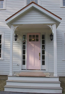
Welcoming Front Door and Front Porch


It was so much fun to collaborate with these design-oriented clients -and our really great craftsman builder, Ken and his crew at Landers Construction- to create such a beautiful home that manages to be both traditional & modern; elegant & friendly; serious an relaxed - all at the same time.

Kudos to the entire team!


Thursday, May 21, 2020

Built-in Bench Seats


Entry bench and cubbies and wall hooks
Built-ins add incredible character and personalization to our home designs, as well as a way to help us be more organized and arrange our stuff beautifully. Built-in benches are close to the easiest thing to build - it could just be a horizontal surface at the correct height- so they can give a big bang for the buck, as opposed to cabinet-style built ins, which can be very pricey.

My previous post was about window seats (cwb-architect.blogspot.com/window-seats), which by my definition are a cozy nook where a person or two can relax and be on the edge of the larger room, skirting the more major function of the room. The bench projects featured here are perhaps more functional than the dreamy window seat. They are located in kitchens, next to a table for eating. They are located in mudrooms or entries as a place to sit and remove shoes or zipper a kid's coat. Since they are usually in working areas they can be surrounded by designed storage.

Mud Room Entry Bench 
The simplest bench is a slab that has open floor space below it. This space can be used for storage of shoes, etc. if the bench is near an entry. (If the bench is at a table, this open space makes a space for the seated person to tuck their feet, adding comfort.) Sometimes we built shelves or cubbies or drawers below or next to a bench seat to organize all the sports/school/outerwear stuff we have near the door. Cubbies can hold bins that act a a more economical "drawer" to hide some of the clutter.


Benches that are not open below should still offer space for one's heels to tuck under for comfort, but the inner area can still be enclosed for storage. Sometimes the lid flips up on a hinge to access the inside space. Sometimes it is noted that that space is not so easily accessible, especially if a cushion is placed atop, and so we keep it simple and just box it in, minimizing the cost by not finishing the interior.

Bench along side of dining table
Corner Banquet Bench in Kitchen


Friday, April 24, 2020

Window Seats


Window Seat is game/reading nook in a casual dining area 
Reading nook window seat on edge of master bedroom
Window seats are special. They are carved from the edge of a room, either bumped in or bumped outward to create a special zone of space unique from the rest of of the room. The nook they create has a smaller scale where a single person can sit, read, think, or just gaze outdoors. It can feel like a room within a room, and can allow a room to feel more comfortable and be used for a greater variety of functions.

Long seat at Dining Room feature window

I love using window seats in my designs, and many clients ask for one. They are space saving and evoke a homey, hygge sense of comfort. I’ve placed them in bedrooms, as a cozy reading nook. I’ve used them in kitchens or casual eating areas as a built-in seat along one side of a table. (Used in this way, the room can be smaller than if chairs, which need space to slide backward, need to be placed all the way around a table.) I’ve used them in large rooms, like living or formal dining spaces, that may not be used daily or often, so that when one is home alone that large space can offer a personal-sized space in which to feel comfortable. I’ve used them in hallways or foyers as a way to make that space more than just a pass-thru area, by creating a place to sit and stay a while.


Built-in bench seat- or display shelf surface- in Farmhouse Kitchen
The design and construction methods for building a window seat can change to fit the space or use of the seat. Sometimes the seat flips up to access storage space inside, sometimes we have cubbies or drawers that are accessed from the front. We can plan for cushions, lighting, and an angled back for comfort. Bookshelves and woodwork and trim and soffits can all be custom designed so that the window seat is a real architectural focus in the space.

Cubbies below seat and bead board wainscotting accent woodwork
Of course to be called a window seat, it has to have a window- or three windows- which is what I tend to do, as you see in my projects featured here! Next blog post I’ll share photos from projects with built-in seats or benches that are not at a window, but are just as functional and beautiful and also add a certain desirable homey quality.

Farmhouse kitchen table designed with built-in bench seating

Monday, April 13, 2020

Renovating for Accessibility & Efficiency

Tub, Vanity Cab, Tile was removed
New Curb-less Shower, Open & accessible
This ranch house was purchased by a couple in order to age in place and some immediate renovations were implemented for accessibility and energy efficiency. The existing slab-on-grade construction already had the perfect "no steps to get inside the door" feature that my client's needed, and this was true whether one came in from the front door/driveway or the attached garage. What didn't work was that some of the passageways were too narrow, the metal-framed sliding glass doors and heating system were old and in-efficient, and the bathrooms needed grab bars and fixtures that allowed for wheelchair access.


Bathrooms were gutted of all fixtures and finishes and a foot was stolen from the dining room (you can't even notice!) to allow space for a roll-in curb-less shower with a linear drain, niches, grab bars, a hand-held shower wand, and space for a bench seat in the master bathroom.  An ADA compliant toilet with grab bar was installed (same location as before), and a new floating vanity counter top offers open knee space below. Door widths into the master bedroom and bathroom were increased to allow passage of a wheelchair or walker. It's difficult to perceive the difference, but the master closet lost a few inches in length to allow enough space to enter around the corner, and new full-height closet doors were installed to increase ease of access and storage.

New Master Bedroom with wider doorway, re-worked closet, and new lighting

BEFORE- closet corner impeded access to the room
One of the sweet features about the existing house was the over-sized triple sliding glass doors off the back- one in the dining room, and one in the family room. The family room door led into a small screened porch, which made that room dark, so we removed it. The family room also had a poorly-placed door leading to the garage, making the room difficult to furnish. We moved that door closer to the kitchen, making the family room have a much better layout. We replaced the cold, metal framed triple sliding glass doors with new insulated glass units. The existing hardwood flooring was damaged by the old metal doors, due to all the moisture and condensation that had built up where they had let in so much cold. The wood was striped back and black stone tile was installed all along the new glass doors- it became an elegant design feature! The home also received all new insulation and an upgraded efficient mechanical system. In the future, a new screened porch will be built off the kitchen, so as not to darken the family room again.

New glass doors w/  stone tile floor inset

Door to garage used to be right where the elephant art is... we moved it so the sofa could be near the fireplace
As we all do our part to fight the Covid-19 pandemic, I hope that those of us lucky enough to have a cozy home and good health can find peace and gratitude while we follow the "Stay Home" orders and find ourselves inside our home much more than usual. Take Care and Be Kind.


Tuesday, March 3, 2020

Historic Home Update- Farmhouse Kitchen

Bright New Farmhouse-style Kitchen
Sometimes a house doesn't need any additional space added. Sometimes enough square footage is there, it just needs halls/doors relocated to create better circulation, windows added for more daylight and views to the outdoors, raised ceilings for a feeling of spaciousness, and updated fixtures and finishes in hardworking rooms like bathrooms and kitchens. That was what we did in this Historic Home Update. Two narrow rooms combined into a generous, sunny kitchen when we removed the dividing wall and added a new beam.

This is the second blog post about this project. To read the first, and see before photos and plans, click the link below:


Exterior View from backyard
Formerly the house had no windows to the back yard- (And that is the south facing elevation... where the sun is... you want windows there!) So we cut in a pair of double-hung windows, with transom windows above, centered in the existing gable. That set the ideal placement for the kitchen sink, and influenced the cabinet/appliance layout.

The east side of the room had 2 windows; we kept one and closed off the other so our cabinetry and range/hood could wrap around to that wall. We kept the exterior trim and detail of that window, though, and closed it with "shutters". In addition, adding a wide sliding glass door from the sitting area of the room to the back yard allows the homeowner to enter from their parked car area and connects the new room to a stone patio extending the kitchen and eating areas into the back yard.

Windows and historic lighting make the Kitchen bright
 Historically appropriate light fixtures, materials, and details were used thoughtfully throughout the design. Both interior and exterior window and door casing mimics the existing style so things "blend". The existing house exterior was covered with asbestos shingle siding, popular in the 1950's which needed to be dealt with properly. The design allowed for that material to be removed only at the back wall- where the new windows and double door were being cut into the wall- and left untouched at the sides. (That's one reason why we kept the side window trim and used the "closed shutter" detail there.)

New Hardi Shingle on back wall
Existing asbestos shingles on side walls
Cabinetry has flush panel door and drawer fronts with bin pull hardware. Open shelving, glass door cabinets, crown molding, and the tiled back splash means everywhere you look you see something beautiful. The light fixtures are wall and ceiling mounted and correct for this historic home. (no recessed "can" lights were used - Yay!) The new structural beam was wrapped in stained wood trim and lends some warmth, along with the wood flooring, to the painted wood trim and cabinets. The counter tops are quartz that looks like marble and the appliance layout creates an ideal work triangle.

Tall Storage Cabinet next to Refrig
Beautiful Details add Charm


Powder Room -Bead Board Wainscot
Historically Sensitive Lighting


I couldn't be more pleased with this renovation. The new kitchen, half bath and second floor bathroom and laundry area (moved upstairs to be next to the bedrooms) make such an improvement to the house, while complimenting it's historic nature. The flow and function of it is better. It feels so new, so improved, bright and large, that it can be difficult to believe no additional space was created - just rearranged and redesigned to the maximum benefit.


Tuesday, February 4, 2020

In-Law Apartment Addition


These clients have long distance family who come to visit and stay for a while. The thinking was that as their parents age and move away from living on their own in Vermont, they may stay for the winter, or even move in permanently someday. This separate "apartment" space was designed to allow for extended family visits, where the grandparents, the homeowners, and their children can still have privacy and autonomy. I organized the floor plan in such as way so the grandparents suite, while connected to the main house, has it's own separate entrance off the front door and is far from the owner's bedrooms. With the separate entrance and spaces that are large enough that a kitchenette could be added someday, this homeowner or a future owner could rent out the apartment someday too, since this village location is zoned for it.

Wood Stove and wide glass doors to the back from the new apartment living room

Sitting Area with double pocket doors to the bedroom

New Bedroom with small windows toward the street and vaulted ceiling
Entry Vestibule -enter main house or new apartment from here
The addition is designed with a simple shed roof shape, punctured square windows, and dark vertical siding. The feeling both inside and out is contemporary, clean and spacious with high. sloped ceilings and transom windows. The new grandparent suite includes a sitting room with a wood stove, glass doors to the back yard and pocket doors to a large bedroom with a huge storage closet and bathroom. The other part of the addition is a new vestibule entry space that has medium grey clapboard siding and does the job both visually and functionally of connecting the two living spaces.

A Contemporary aesthetic - high square windows for privacy
This is the second addition I designed for this village ranch. Check out the first addition here:
cwb-architect.blogspot.com/2016/modern-addition&renovation

Tuesday, January 21, 2020

New Colonial Home

At first glance, this new house might seem like it is just re-doing an over-used style - "The Colonial"- but the truth is in the details, and this house is surely unique! A "New Net Zero Farmhouse Colonial" is under construction with CWB Architect and I will write a few blog posts over the next months to show you all what went into the design and construction of this special place.

Front/North Elevation
My clients came to me with a dream of building their family a home in the Hudson Valley. They purchased a private wooded lot and had it partially cleared. We tramped around the acreage looking for ideal placement for the detached garage, driveway, and a stately spot for the home. The solar orientation was analyzed and the soils were tested for a septic system.  From the beginning they knew they wanted the curb appeal of a traditional-looking home in a classic colonial farmhouse style. One of the things about designing a home from scratch, instead of an addition to something already built, is that you can do "anything". Having the constraint of using simple rectangular massing and strict symmetry actually gave me a nice starting point instead of a blank page.
In geometry, a golden rectangle is a rectangle whose side
lengths are in the golden ratio, which is (the Greek letter phi), where is approximately 1.618.
Golden rectangle - from Wikipedia
Since I knew it was going to be a "box", I started with the ratio known as The Golden Rectangle. Creating the square footage inside that they wanted to have, I came up with what size/proportion the floor plans and elevations could be and be close to a golden rectangle. I also used standard rules of layout for window & shutter & door placement on the front- where we had very little leeway due to the imposed style. (At the back -which is the sunny south elevation, much more fun and interesting window fenestration arrangements could occur.) Pains were taken to ensure correct vertically oriented double hung window and divided light proportions and proper alignments throughout. And of course this rigid exterior layout had to be made to work with a much more up-to-date and open interior partition layout.
South Elevation
While a straight box with a simple gable roof and white clapboard siding is what you see from the front, the south elevation facing the back has a more free arrangement of windows and a full covered  porch and to offer some summertime shade.The interior manages to be both formal/classic and friendly/warm at the same time and the open plan belies the standard "colonial" exterior face. The 10' tall public social spaces are all located along the sunny back/south and are open to each other and to the back porch and back yard. The front of first floor has a guest room, small office, bathroom, and mudroom/side entry. The second floor is grand with a wide center hall around the open stair railing and large bedrooms, but is family friendly as well with a second floor laundry room, and a cozy window seat for sitting and dreaming.

Window Trim, Metal Roof, Front Porch, and Septic System
Selection of window style: Simulated divided Light double hung units - with cottage style on the first floor are from Marvins  "Elevate" collection. Exterior materials and details are deliberately classic: white clapboard siding and trim by "James Hardi", window trim with angled sills and drip caps, standing seam metal roofing, and white bead board porch ceilings. Just wait to see some more pictures once we get the porch post wraps and support brackets and decorative gable trim and corbels!
Windows with correct proportions & traditional wide trim


Wednesday, January 8, 2020

From Cape to Craftsman


BEFORE- view of back

This project begins as a 1950's cape cod style home, that got modified in the 70's/80's with a back greenhouse and step down sun room with a long, low pitch roof. The rooms were dark, with paneling and small (or no!) windows to the outside and the kitchen was trapped in the center of the house. These old additions had been thoughtlessly added, leading to roof drainage issues, strange steps down from room to room, and low ceilings. The new owners liked the village location, but some serious upgrading was in order!
BEFORE- front breezeway/garage

Our transformation "From Cape to Craftsman" begins with the idea to remove the greenhouse and the long, low roofs off the back and to create a more organized and cohesive layout of rooms and roof shapes. We removed the front and side of the breezeway and garage, which was too small to fit 2 cars. The former breezeway entry area becomes the new laundry room at the same floor level as the main first floor with a mud room entry connecting to the garage and the to the cellar stairs. This end of the house gets new rotated gable roofs for a more pleasing front elevation. (and proper drainage)
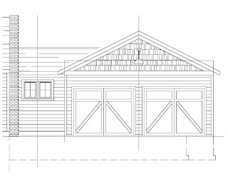
Proposed New Laundry Room/Garage Front Elevation

The interior was gutted for a new more open and accessible layout that includes a first floor master bedroom suite and a laundry room. (Side note: Everyone I meet would like to get their laundry out of their basement!) Out of date finishes like wood paneling, wall to wall carpeting, and stone around the fireplace were removed, as well as the inefficient mechanical systems (getting off oil!), old wiring, kitchen, and bathrooms. A new spacious kitchen will be located at the back where the greenhouse was with windows and a glass door to a new back-yard screened porch and a wide opening to the eating area. The former front first floor bedroom has been opened up to the front entry area and combined into a large living room across the entire front with a special cozy place called an "Inglenook" to be built around the fireplace. A small addition will be constructed behind the house for the new master bathroom. The second floor layout remains mostly as is but they are upgrading the insulation, windows, finishes and bathroom. More photos soon!


BEFORE - Greenhouse space

BEFORE - Dark and Small Landlocked Kitchen

BEFORE - Dark and Dated Living Room
Demolition of Greenhouse and former Sun Room begun

LR carpet, paneling, and stone fireplace surround removed