Thursday, October 29, 2015

Framing the View

http://www.olana.org/olana-gallery/
Those who aren't architects may think what we do is draw on paper, creating directions from which construction workers build "brick and mortar" (or wood and siding) structures out in the world- and that's true to an extent. Some aspects of my job can be fairly simple problem solving - making a space the right size, keeping the weather out, letting light in, facilitating people to be able to walk from one space into another. But of course - architecture is so much more! I love when I get reminded of the magic and I get reinvigorated to do good work.

This happened last week when I went on a tour of Frederick Church's famous Hudson Valley home, Olana, and I saw glimpses of what I and other architects do when we design - we layout space/walls/windows/doors to frame views.

Frederick Church was a Hudson River School painter. Wikipedia says this is the name given to a mid-19th century American art movement embodied by a group of landscape painters whose work depicts the Hudson Valley and the surrounding area. He designed his home (in a very unique, blend of Victorian, Persian, & Moorish styles, which I won't be discussing here) using the same principles good architects use all the time- and that were important to him as a landscape painter- framing views.

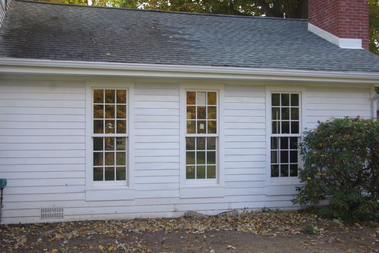
Screened Porch Structure frames the view in the backyard
When we first entered the house, the tour guide pointed out the long view through the home's length, and right out the studio windows toward the Hudson River. (No photos allowed inside the building, so I don't have one to post here) This is a technique I often employ in my designs. Any house feels much bigger, brighter, and spacious if, when you step inside the entry door, you can see through a window on the opposite side. Long interior views and aligning windows and doors to create views is part of good design.


Long view from Kitchen toward Family Room
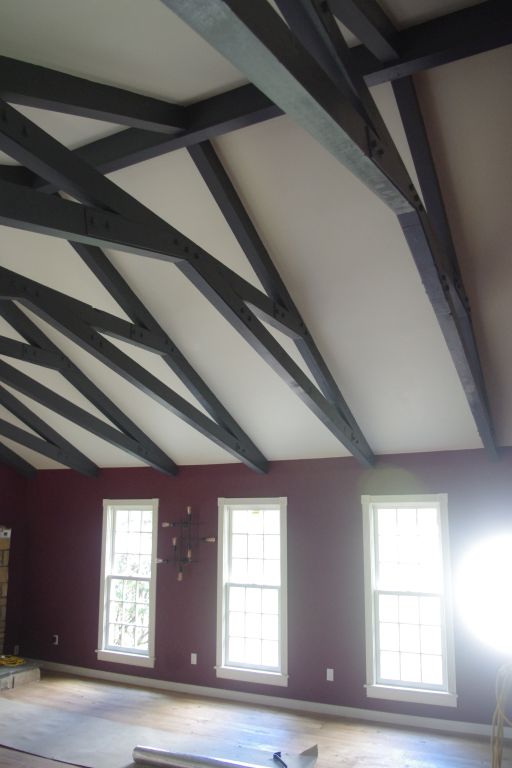
Here are a couple pictures at a current project with a space I called the "Gallery" (a very generous hallway) connecting the existing part of the house with the new addition space. (Before our renovation, this space was a small screeened in porch) This "hallway" is enlivened with arches and columns; it is wide and provides a door to the deck outside and to the powder room and linen storage inside. (with more aligned views, of course, planned to showcase the owner's antique linen armoire cabinet by the powder room as one walks inside from the deck) In addition to those "programming" and "circulation" tasks, this space does something for the feel of the house - it creates a long view between the kitchen and the family room - aligning with large windows with transoms facing north toward the wooded side yard. This technique lends a sense of openness, light, and connection- even drawing a person from one space to the next.

Long view (with columns now built) from FR toward Kitchen
It was fun to be reminded of this aspect of my design for a client while on a tour of Olana. If you want to read more about "Interior Views" in my designs, check out this page of my website:
http://cwb-architect.com/interior sightlines

Thursday, October 22, 2015

The Transformation Continues...

See Transformation Part 1 for the first post about this project.

We added a first floor master suite and a large great room on the north side of the existing house. Existing room functions were swapped - the dining room moved into what was the living room; the old dining room was chopped into a new pantry and butler's pantry, as well as increasing the size of the kitchen. We moved the laundry room and added a stair to access a finished recreation room in the lowest level. We added porches and a large deck and lots of glass doors. We sheathed the entire building with rigid insulation and spray foamed the roofs and box beams. We installed new energy efficient dark green 4 pane windows, added a box bay in place of the dated bow window, and lots of classy trim details. We re-roofed with standing seam metal (not yet- you see roof membrane in these photos) and slate-look shingles.  The old chimney was extended higher and changed to stone from brick. Blue vinyl siding and fake vinyl shutters were removed and new grey cementitious clapboard and board and batten-style siding was applied with lots of trim accents.

Here are some progress photos showing before and after (really during) shots so you can get a feel for the scope of this transformation:

Front- before
New front view (addition on left) 
Detail view of new Box Bay that replaced dated bow window on front

Screened Porch- before- was small and tucked into house
New 3-sided elevated screened porch has much more outdoor feel

Chimney- before
Re-faced chimney - now grey stone

Dining Room- before
Space that was the Dining Rm has become part kitchen & part pantry space

Living Room- before
Former Living Rm is to be new formal Dining Rm w/ box bay & added side window 

Long view from Kitchen through arched Gallery Space toward new Family Room
New Family Room space in addition w/ vaulted ceiling & transom windows


Wednesday, October 14, 2015

Raise the Roof


Trusses are great - they enable us to put a roof (or floor) over long spans so we can have large, open rooms, like this family space with a fireplace, TV, and billiards table.

The truss in the existing room, however, was oppressively low. This playroom was placed a couple steps down from the rest of the main floor level of the house, and to walk from the kitchen into the playroom, the bottom chord (horizontal member in b4 pic) actually encroached into the code-required head room. (Code requires 6'-8" vertical space- the height of all standard doors).

In addition to the code violation, it just felt yucky. Here you were, in a large space, with a not-flat high ceiling, but with those thick, dark beams cutting across the space at the top of the wall, you didn't get the benefit of that tall space- you felt squashed from above.
Old Truss Configuration w/ heavy, low bottom chord
Without changing the roof outside or ceiling inside, we modified the truss to raise the interior volume. Don't try this at home! A structural engineer was consulted and angled metal plates with specific bolting patterns were specified to ensure the roof loads were being carried. The low horizontal chord was removed (and some that wood re-used). New angled bottom chords and a high collar tie (the reused timbers) were secured to the existing top chords that follow the ceiling line.

New Truss Configuration
The result is a room that feels much different. We joked it seemed like a pizza parlor before. Now the feel is much more lofty. We also changed the small, high-silled windows to beautiful low-silled 9 over 9 paned windows with a classic molding profile; they let in lots of light and are much more appropriate from the exterior for this historic home. Removing the dark wood wainscot also contributes to this room's transformation. And installation of a new split system for heat and air conditioning means the unsightly baseboard radiator could be removed, allowing for cleaner wall to floor transition.

New windows (same door to kitchen on far left of both pics)

Before- Yucky windows - no light or view!


Take away: space is about more than just space.

New Room - trusses painted


Newly renovated, more classic exterior

Thursday, October 8, 2015

From Tractor Garage to Office- Part 2

New Office / Pool House
See From Tractor Garage to Office- Part 1 for first blog post about this project.

I stopped by this project recently and my client has begun to get settled into his new office space. What was an unfinished space housing an oil tank and tractor and sporting a dirt floor, is now an up-scale office space for publishing with climate control, new windows, radiant floors, A/C and beautiful lighting & floor finishes.

New Office Space (same window locations as b4)


Before - Tractor Garage (note windows)

(Foggy Pic of) New Office / Pool House

Garage -before

I mentioned that when doing a separate, small structure people may be more willing to take risks and select some colors and finishes that they might not be bold enough to try out in the main house. This office/ guest house/ pool house may be an example of that. With fun colors and floor patterns, it is fresh and unique.
Inside the space - looking from office toward mechanical closet and bathroom
Bead Board Ceiling in Bathroom